Data Interpretation – Concepts for Aptitude
Data Interpretation (DI) is a critical component of most aptitude tests for placements, focusing on a candidate’s ability to interpret, analyze, and draw conclusions from a given set of data. In these questions, data is usually presented in the form of tables, bar graphs, line charts, pie charts, or a combination of these. Candidates are required to understand the data and answer related questions, often requiring calculations, comparisons, and estimations. Some believe that Data Interpretation should be an independent section itself but since it carries limited weightage, we have clubbed it in Quant section. Also if you have a number oriented mindset, this section is very easy for you.
Understanding Data Interpretation (DI)
Data Interpretation refers to analyzing visual data formats like graphs, tables, or charts and using it to answer specific questions. The focus is on:
- Recognizing patterns and trends
- Calculating percentages, averages, ratios, and growth rates
- Drawing insights from the data provided
- Making comparisons and understanding proportions
Types of DI Questions:
- Tables: Display data in rows and columns, often requiring calculations across rows or columns.
- Bar Graphs: Use bars to represent values, useful for comparing quantities across categories.
- Line Charts: Show trends over time or a continuous variable.
- Pie Charts: Represent data as proportions of a whole, helpful for understanding distribution.
- Mixed Graphs: Combinations of different types of graphs, requiring complex interpretation.
Core Concepts and Calculations
To succeed in DI, you must be comfortable with:
- Percentages: Essential for understanding growth rates, proportions, and comparisons.
- Ratios and Proportions: Useful for comparing values within the data set.
- Averages: Often used to summarize data sets.
- Growth Rate and Percentage Increase/Decrease: Important for questions involving time-based data.
Let’s go over these with examples.
Solved Examples for Each Data Format
Example 1: Table-Based Question
Data Table
A company’s sales for four products (A, B, C, and D) across four quarters in a year are given in the table below.
| Quarter | Product A | Product B | Product C | Product D |
|---|---|---|---|---|
| Q1 | 200 | 150 | 100 | 80 |
| Q2 | 180 | 130 | 120 | 90 |
| Q3 | 220 | 160 | 150 | 100 |
| Q4 | 250 | 170 | 180 | 110 |
Questions
- What is the total sales of Product C throughout the year?
- By what percentage did Product A’s sales increase from Q1 to Q4?
Solutions
- Total sales of Product C: Add the sales across all quarters. = 100+120+150+180 = 550. So, total sales of Product C is 550 units.
- Percentage Increase in Product A’s sales from Q1 to Q4: Percentage Increase = $\frac{{250 – 200}}{200} \times 100 = \frac{50}{200} \times 100 = 25\%$. So, Product A’s sales increased by 25% from Q1 to Q4.
Example 2: Bar Graph-Based Question
Bar Graph
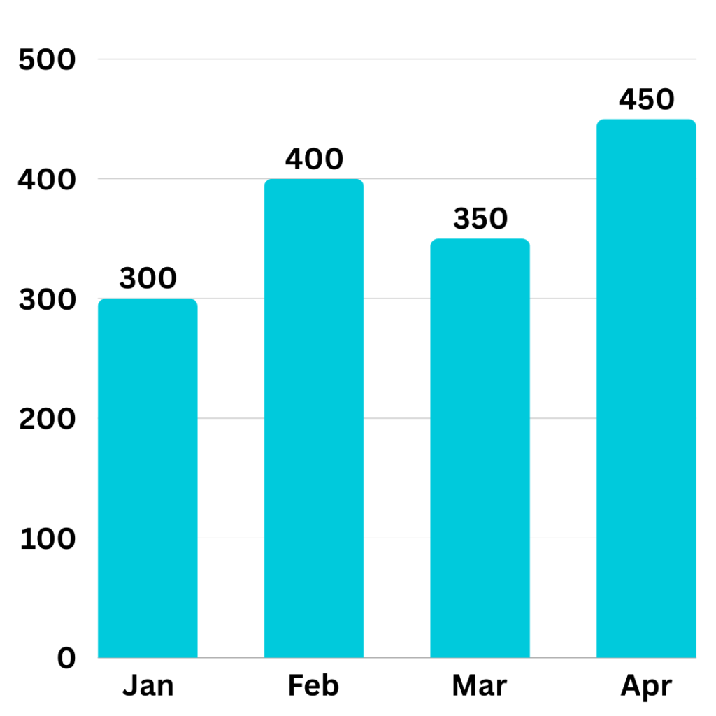
The bar graph below shows the number of units produced by a factory over four months (January to April).
Questions
- Calculate the average monthly production over the four months.
- By what percentage did production increase from January to April?

Solutions
- Average Monthly Production:= (300+400+350+450)/4 = 375 units
- Percentage Increase from January to April:= (450−300)/300×100 = 50%
Example 3: Line Graph-Based Question
Line Graph
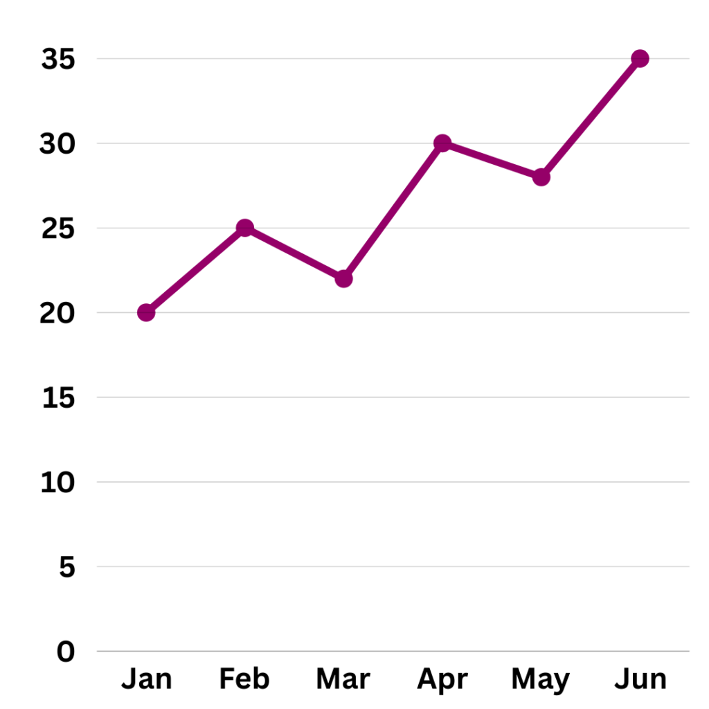
The line graph below shows the monthly sales (in thousands) of a product from January to June.
Questions
- What was the average sales over the given period?
- What is the total sales increase from January to June?

Solutions
- Average Sales:= (20+25+22+30+28+35)/6 = 160/6 ≈ 26.67 thousand units
- Total Sales Increase from January to June: = 35−20 =15 thousand
Example 4: Pie Chart-Based Question
Pie Chart
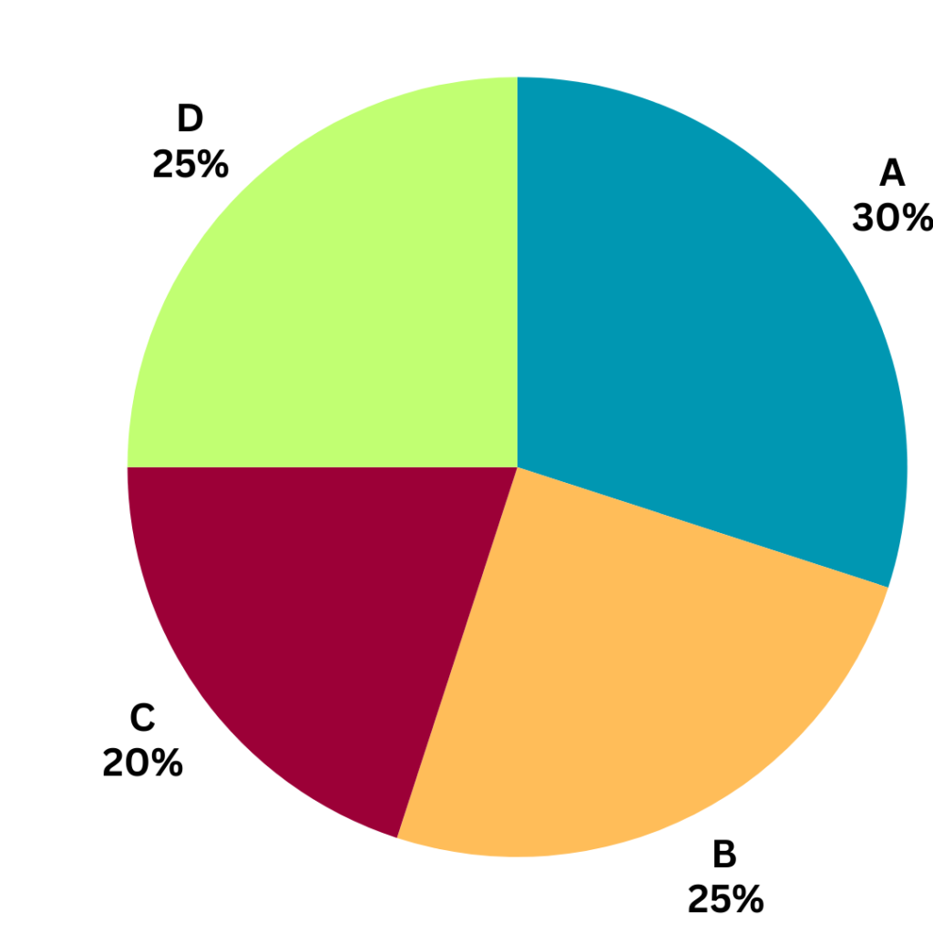
The pie chart shows the market share of four companies in a region.
Questions
- If the total market size is 1,000 units, how many units does each company control?
- Which company has the largest market share, and by how much more than the smallest?

Solutions
- Units Controlled by Each Company:
- Company A: 30/100×1000 = 300 units
- Company B: 25/100×1000 = 250 units
- Company C: 20/100×1000 = 200 units
- Company D: 25/100×1000 = 250 units
- Market Share Comparison:
- Company A has the largest market share at 30%.
- The smallest is Company C at 20%.
- Difference = 30% – 20% = 10%.
Tips for Tackling DI Questions Effectively
- Understand the Graph Type: Each format (table, bar graph, etc.) has unique interpretations. Quickly identify the type and familiarize yourself with the data.
- Scan the Data First: Before diving into calculations, get an overview of the data. Look for maximum/minimum values, patterns, or trends.
- Practice Mental Calculations: DI questions often require quick calculations. Strengthen skills in approximation, percentages, and fractions.
- Focus on Units and Labels: Carefully read units (thousands, percentages) and labels to avoid mistakes.
- Time Management: Don’t spend too much time on one question. If a question seems complex, mark it and revisit if time allows.
Read concepts and formulas for Algebra: https://www.learntheta.com/placement-aptitude-algebra/
Refer Aptitude Questions with Solutions on Data Interpretation: https://www.learntheta.com/aptitude-questions-data-interpretation/
Practice Aptitude Questions on Data Interpretation with LearnTheta’s AI Practice Platform: https://www.learntheta.com/placement-aptitude/